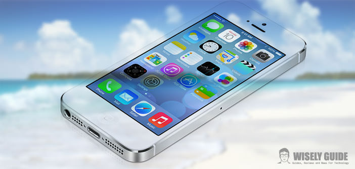
iOS 7 – Change Everything
Many new products at this WWDC 2013 Keynote opening and also a pleasant lightness in the presentation, but long conducted with serenity and a few smiles. The software was at the center of everything, but there was also room for the eagerly awaited update of the MacBook Air, Airport to Airport Extreme and Time Capsule, and a brief anticipation of the future Mac Pro Most of the spotlight were dedicated 7 to iOS, in beta as of today for developers and available for the fall for everyone else (assuming you have one of the supported devices: iPhone 4/4S/5, iPad 2 from onwards, mini iPad and iPod touch fifth generation stops running iOS 6 instead of the iPhone 3GS and iPod touch fourth generation).
iOS 7 – Apple has not made his usual incremental improvements, with new features and lower facelift, but it is divided from below, by changing how everything appears, even the classic animations that were used by opening the app. At first glance it would seem the result of a deep customization post-jailbreak, and this ensures the effect of novelty that many Apple users demanded in a loud voice.
New does not necessarily mean innovation, and much of what we have seen is due to external stimuli, but the hand is present. As it was now acknowledged the skeuomorphism has been eradicated in favor of a minimal interface and flat. In many respects, it has aligned with the competition, it must be said, but he also managed to incorporate touches of originality as well as new features.
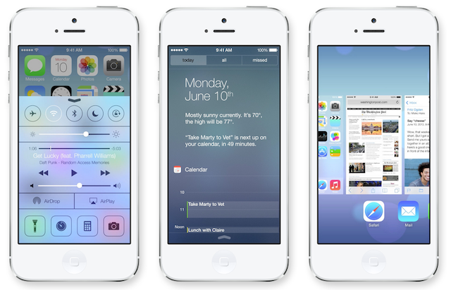
Thanks to translucent surfaces, shadows and levels that move at different speeds, can create the illusion of the third dimension. Not going to list all the aspects of the metamorphosis of iOS 7, are too many and embrace every app and area of the system, but we can identify the main agents of change. Along with interfaces that simulate reality, provisions to have been made even graphic structures in excess. New icons flat (some hard to digest), new dock, new folders with paging, newsstand without wood. The lock screen has not superimposed rectangles but only letters and icons, and the slide is now up. The opening animation of an app’s icon and now part of the task manager is visual, with preview screens. We salute the effect of ” linen ” in the Notifications Center, eliminated in favor of a dark semi-transparent foil, and welcome to the Control Center.
From the bottom, we can activate this new area, where Apple has included everything that was asked and even more. At the top, we have the toggle for radio connections, activate the silent mode and rotation lock, just below the slide for brightness and media control, complete with volume and quick search. Alongside AirPlay is another good news that many expected: Airdrop. Thanks to this we may finally exchange files quickly with other Apple devices nearby, and without the need for any configuration. The last row of icons is dedicated to use as a torch (now integrated in iOS), timer, calculator and camera.
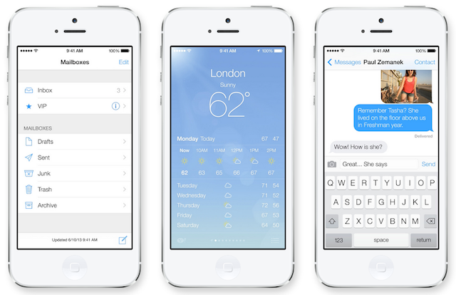
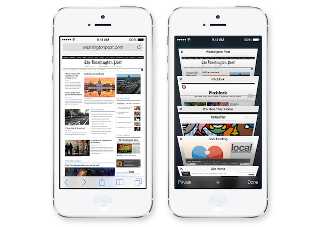
The apps are all very different in appearance and have gained little features here and there, but the changes affect your bricks of the interface to the OS. It is different from the keyboard (white or black depending upon the context). The line is indicated by bullets (and no more cleats). The primary colors are white, gray and black topped by blue and pink: colors wisely. Safari highlights the good one aspects of this new design, where the interface tends to disappear completely, and its elements become part in the content. The visual effect is ” clean ” but perhaps not as convenient as the current iOS, especially for children and the elderly.
On Safari, we can share links on twitter, generate and store passwords to sync to iCloud and have a full screen display also vertically. Siri will have new voices and more modern graphics and iOS in 2014 will as well come into the car, which will allow use to use many of the functions of the iPhone, such as Music, Maps and Phone directly from the display of the cars of Ferrari, Mercedes, Jaguar, Honda, Opel, Volvo, Chevrolet, Hyundai, etc. ..
Along with iOS 7 was also presented the famous iRadio, which will be called iTunes Radio and will be available for free to paying users of iTunes Match, initially only in U.S.. The service will enable you to listen to a song from similar songs departure and if desired, to purchase them. It’s not exactly full access and fees to all music in iTunes, but it is a start and it’s free for all (also in U.S.) with banners and completely free for those who have subscribed to iTunes Match.
Of the many new, features have been added purely aesthetic impact, dare I say wisely, some function that complement well iOS. Many things have already seen. Others may not like it, and others impress, but the upside is that they are many. After 6 versions, Apple has finally taken my courage in both hands and risked. This means we should not take too much for granted, and we should test and digest everything before you can make a personal judgment. My first opinion is positive for the new functions (some of which were made to wait a long time) and a little doubtful for the appearance of many icons and some aesthetic details (which I hope will look better on the iPhone display). iOS had gone on, that’s for sure, it is immediately richer and more modern, but has also lost its historic aesthetic connotation in favor of a design similar to many others.