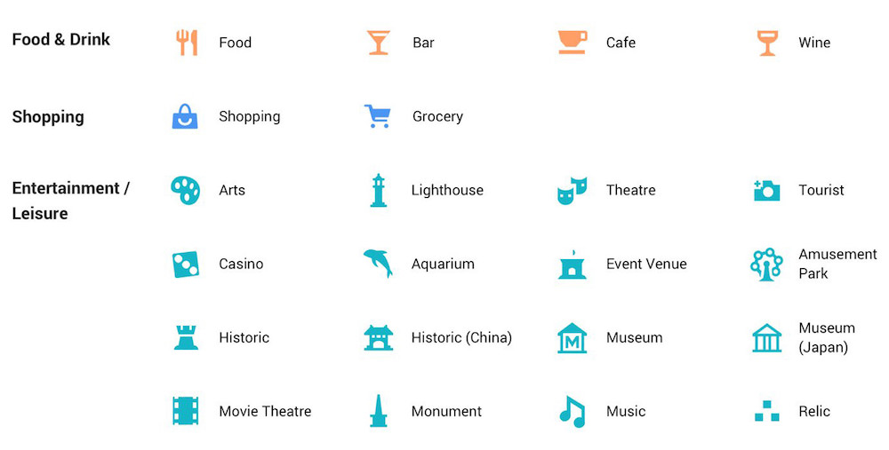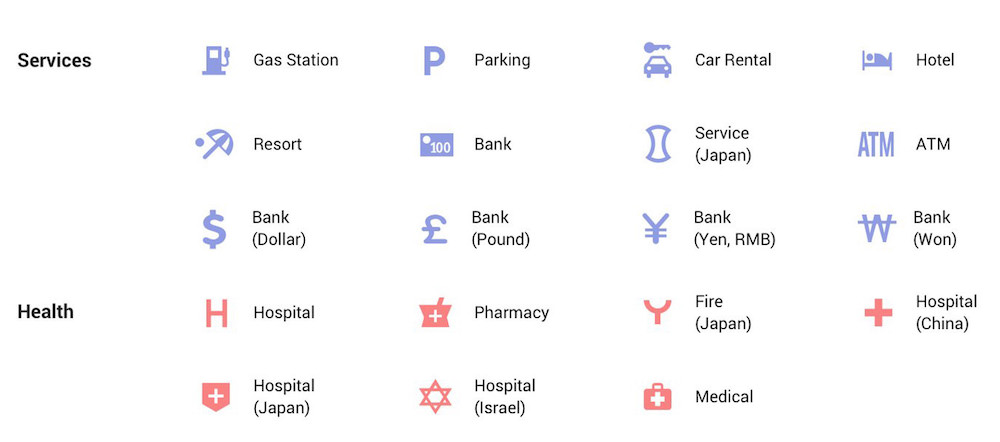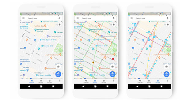
Google Maps receives some news on the aesthetic plan so as to make some of the information that appear in the maps more visible. The new style now offers refueling stations more clearly than other points of interest, as well as the railway stations within the maps relating to means of transport. In general, the whole color scheme changes, with new icons that identify all the points of interest.
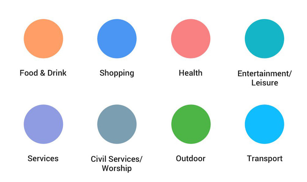
A small detail that drastically renews the browsing experience on one of the best online services on the market. Suffice it to say that previously, the service used the same color (blue) for the vast majority of points of interest, indicating in the same way, for example: shops, bars, or offices of doctors and health specialists. Thanks to the novelties each point of interest will be marked by a different color according to its category.