Google Maps changes look: Here’s what changes and all the new icons
The Google Maps mobile client is renewed in some stylistic aspects, modifying the color of some elements to give them more or less importance.
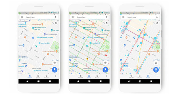
Google Maps receives some news on the aesthetic plan so as to make some of the information that appear in the maps more visible. The new style now offers refueling stations more clearly than other points of interest, as well as the railway stations within the maps relating to means of transport. In general, the whole color scheme changes, with new icons that identify all the points of interest.
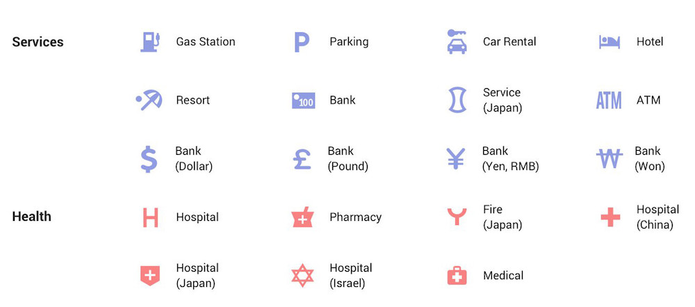
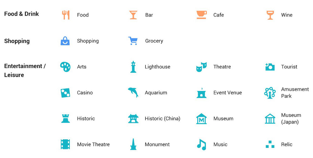
A small detail that drastically renews the browsing experience on one of the best online services on the market. Suffice it to say that previously, the service used the same color (blue) for the vast majority of points of interest, indicating in the same way, for example: shops, bars, or offices of doctors and health specialists. Thanks to the novelties each point of interest will be marked by a different color according to its category.
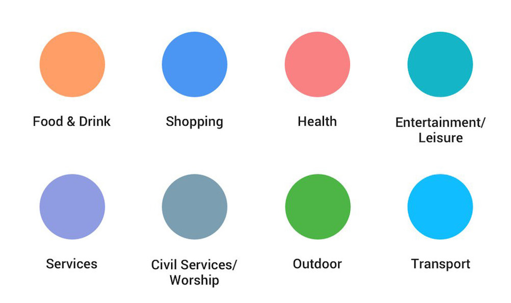 Places where people eat or drink are marked orange, stores remain blue, doctors offices are pink, and entertainment and leisure facilities will be green. The green will signal the outdoor seats, while public transport will be indicated in blue. It can be pointed out that some of the colors seem rather similar, a characteristic that could lead to confusion both to users with normal vision, and above all color blind.
 There will be icons on the map for any closed roads, work in progress and car accidents along the way. All devices using Google Maps will receive the update ” in the coming weeks “, and not only the apps for smartphones and tablets, but also on Assistant, Google Search, Google Earth and Android Auto. The changes will also come to sites that integrate maps through Google Maps API released by Google.