That’s why Apple has chosen font San Francisco for Apple Watch
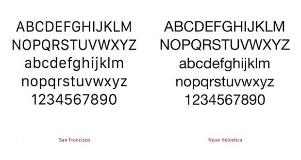
In the interface of Apple Watch was used font ” San Francisco “, which according to a recent rumor could arrive soon on iOS 9 and even on OS X 10.11. The character of the Apple operating system has been changed recently, when iOS 7 introduced the Helvetica instead of the ” old ” Lucida Grande, then arrived on OS X with Yosemite.
Some users do not like these changes continue and for others may be a minor problem but what you have to understand is that with iOS 7 if the change was prompted by a question of style, in this case the purpose is more important.
The font San Francisco was created and chosen by Apple for the smartwatch because of its high readability, particularly in the small text. A study published by TypeDetail (by 9to5Mac) shows that the lowercase letters of this nature have a height just slightly less than that of the capital, with the result that for a given size than other fonts are larger and readable.
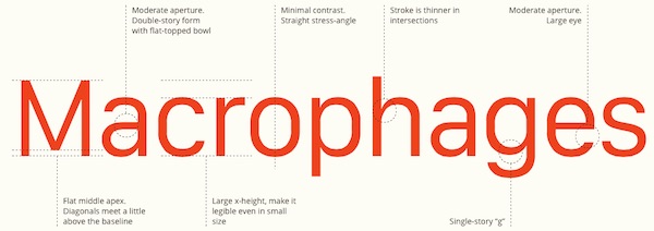
There are many other measures that improve the visibility, but this is probably the most important for small screens. Obviously, this does not justify the extension of the same font in environment iOS and OS X, but we know that Apple prefers consistency and so it is actually possible that all future operating systems are based on San Francisco. A little more visibility will not harm us, especially on smartphones where many have criticized the readability Helvetica.